gym partner-connection
Transferring Solo Gym Journey into A Collaborative Experience
Name
SpotMe
Duration
4-month
Team
1 product designer, 4 developers
Tools
Figma, Figjam, Jira Software, Miro, Recraft.ai, Google Slides;
SpotMe is a gym partner-connection mobile platform that energizes gym newbies and help them to achieve their fitness goals by connecting gym users, fostering a supportive community, and providing positive interactive feedbacks like achievement badges and daily check-in.
Background
This is a fellowship program that was held in Boston University. Our product addresses the common challenges individuals face when starting and attending gym sessions alone. The innovative solution revolves around a robust matching system that connects users with compatible training partners who can support, guide, and keep them accountable throughout their fitness journey.
My Contribution
As a product designer, I solved user’s pain points by:
Responsible for the product’s interface and user flow, I designed intuitive UIs prioritizing usability and accessibility, incorporating UX best practices to enhance user satisfaction and engagement.
Conducted usability tests and received feedbacks from users to iterate the product for better user experience, balancing the product prototypes with the minimum viable product
Maintained open channels with team members and the product owner, ensuring seamless integration of design elements with development efforts.
Gym beginners face many challenges in their pursuit of better health and improved performance:
Pain Point 1
No training knowledge
Gym newbies feel unsure and socially worried about going to the gym due to lack of experience on using the equipment.
Pain Point 2
Purposeless
Gym newbies don’t know what to do in the gym or feel overwhelmed at the moment step in to the gym.
Pain Point 3
No way of keep consistency among others
Gym newbies don’t know how to track progress, leading to a negative experience.
A Recent Study That Provides An Ultimate Solution.
A new study of 4,358 elderly individuals in Japan revealed that those who exercised with partners at least twice weekly were less likely to experience cognitive impairment compared to those who exercised alone or not at all.
The presence of a workout partner has been demonstrated to enhance motivation, increase our sense of excitement, and improve the probability of sticking to our exercise routine.
We found that “provide a connection for gym partners” might be one of the solutions for gym goers to pursue better health and improved their gym performance.
SpotMe provides an exclusive experience for gym enthusiasts to enhance their workout experience by engaging achievement system that gamifies workout routines and foster a gym community focusing on mutual support.
BU Launch Lab Funding
SpotMe has received a stipend from Boston University's Spark Launch Lab that helps students launch their products into the world, including acquiring users and adoption.
Our teams will be advised on product strategy and provided with support for prioritizing weekly development sprints in service of launching a product.
To design an app for gym newbies to connect with experienced gym goers so they can be motivated to workout, be part of the community, and foster workout habit, we conducted a series of user research, design, and iterations.
Interview and Survey
Key Takeaways for Interviews:
Seeing other beginners in their position helps
Training with someone else gives them guidance and security.
An accountability system that rewards consistency will be a helpful feature.
Key Takeaways for Surveys:
Negative Emotions: 65% of participants experienced negative emotions when entering the gym for the first time.
0 Training Knowledge: 77% of participants agree that lack of training knowledge is a big factor preventing them from training.
Don’t Want to Workout Alone: 53% of participants skipped their session due to a lack of a partner or don’t want to workout alone.
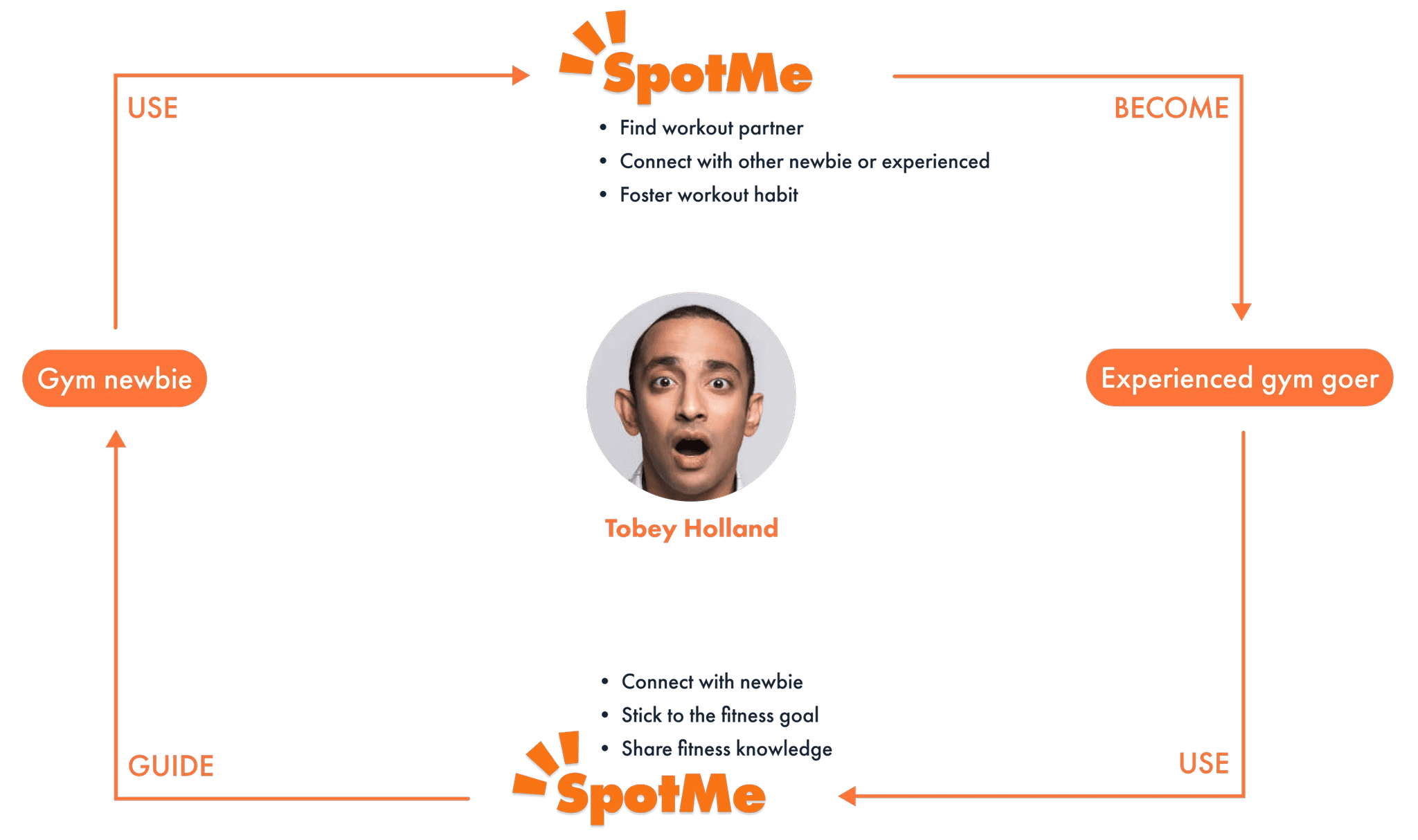
During our define sprint, I mentioned the user circle below that might be a good illustration for us to better identify the overall user flow within our app. In the circle, by using SpotMe to find workout partner and connect with other newbie or experienced gym goer, our users will become experienced and they can give back to the community by guiding new gym newbies.
This circle will also point out some hints of our addable features in the app that can let users to stick with our product while using it.
Defining
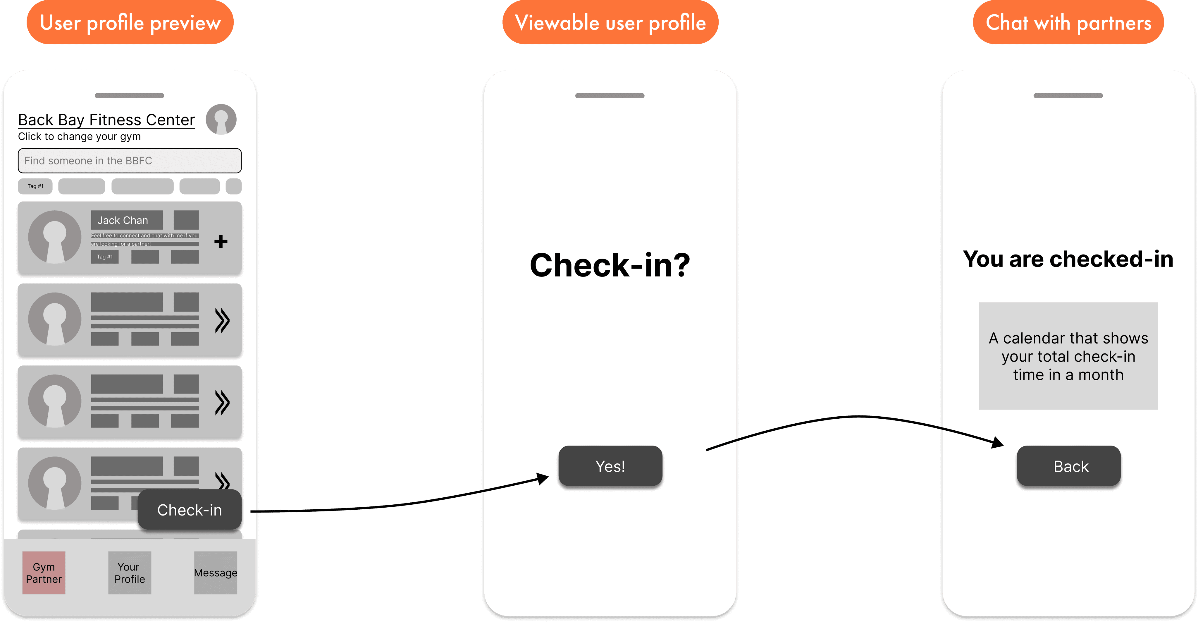
We conducted two competitor audits that also focus on improving gym experience and gamification experience. During this time, we also made an affinity diagram and information architecture for our product structure. Based on these information, we have several user flows for a basic outlook for SpotMe.
User Flow #1: Gym Partner Connection
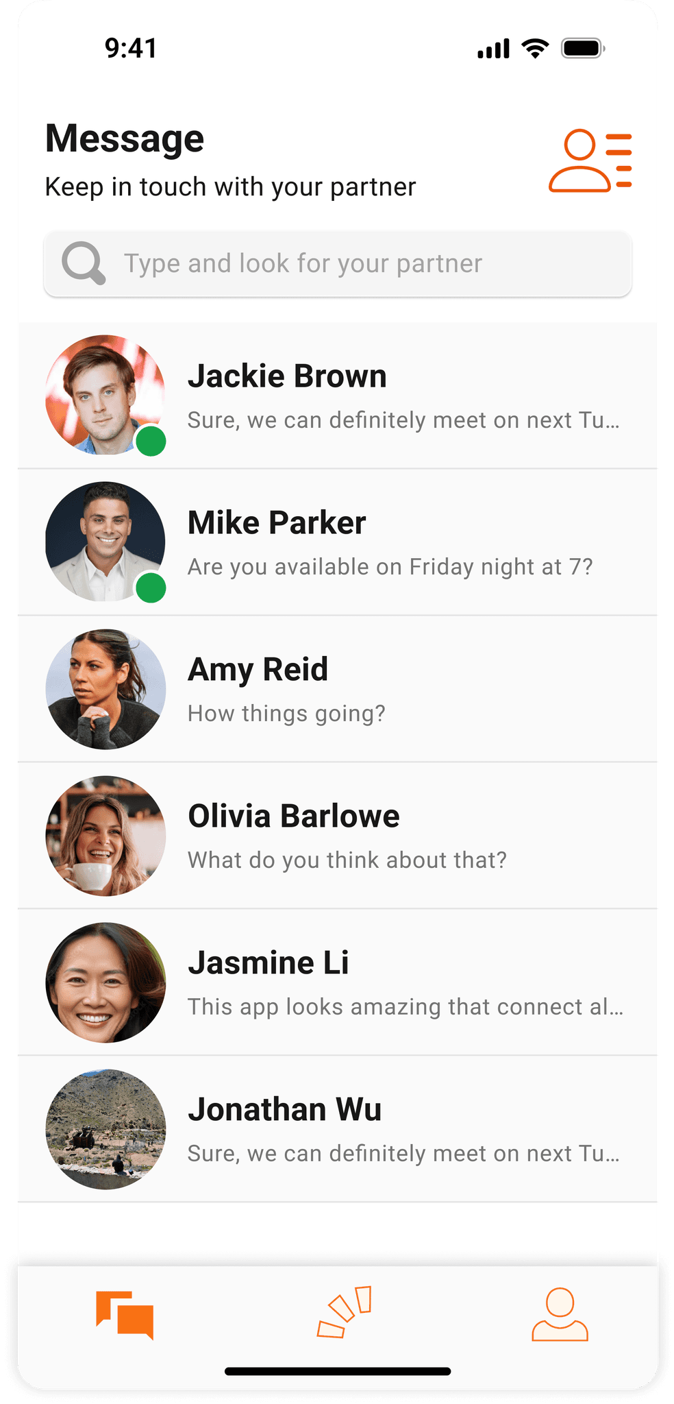
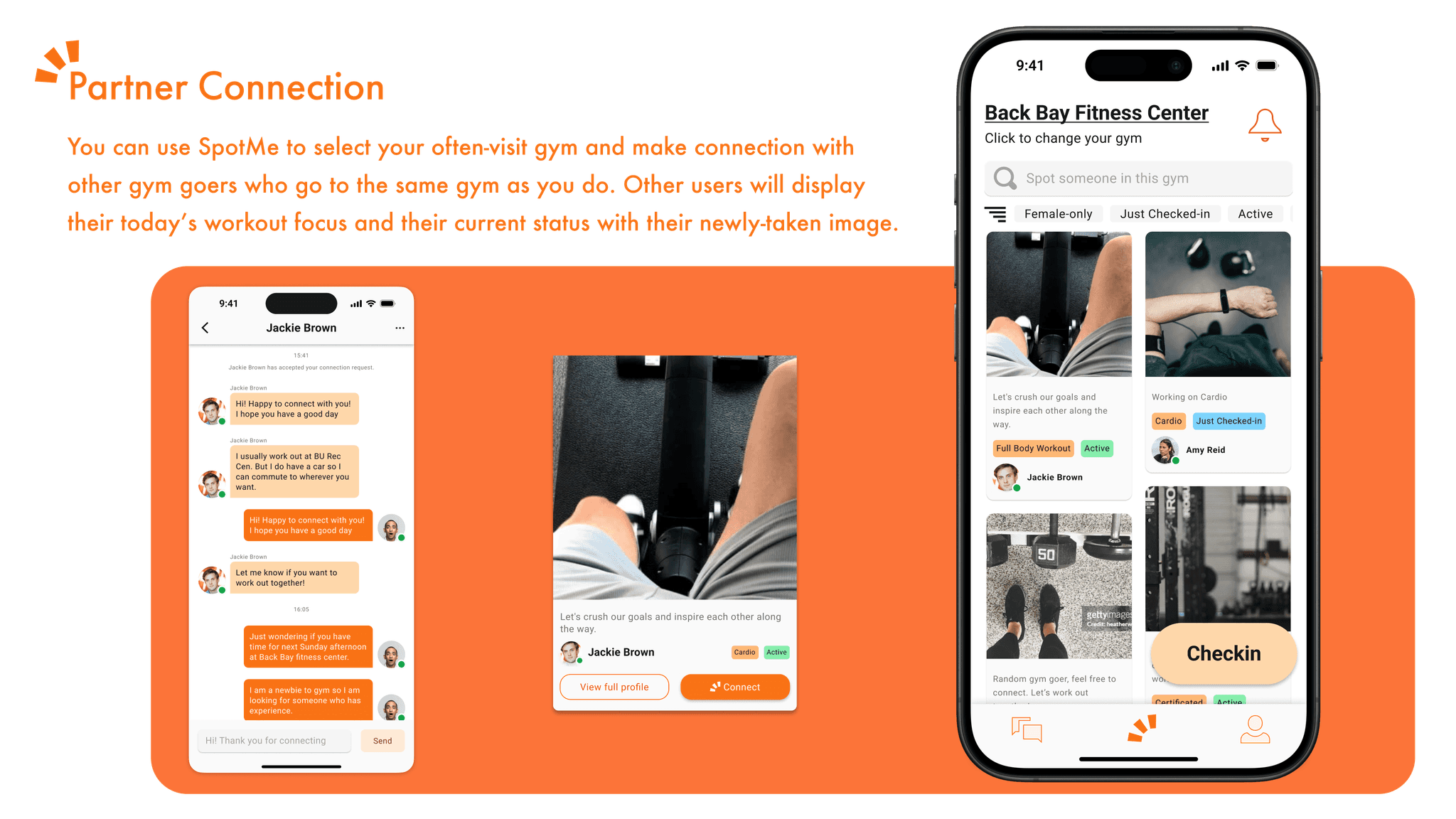
It shows how a user select his often-visit gym, view and select a partner from the partner list, and decide to chat and connect with the selected partner.
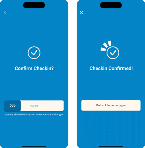
User Flow #2: Daily Check-in
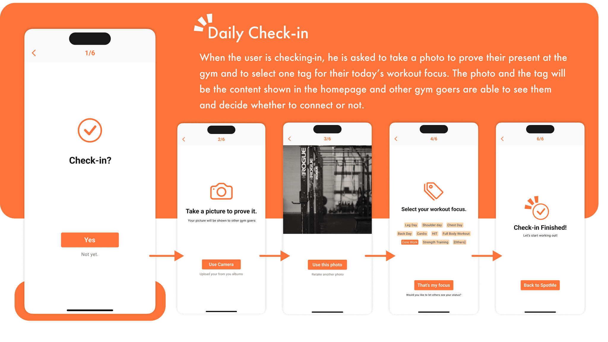
It shows how a user check-in every time he arrives at the gym and ready to workout. The check-in button will be disabled if the user is not near his often-visit gym.
Design & Prototyping
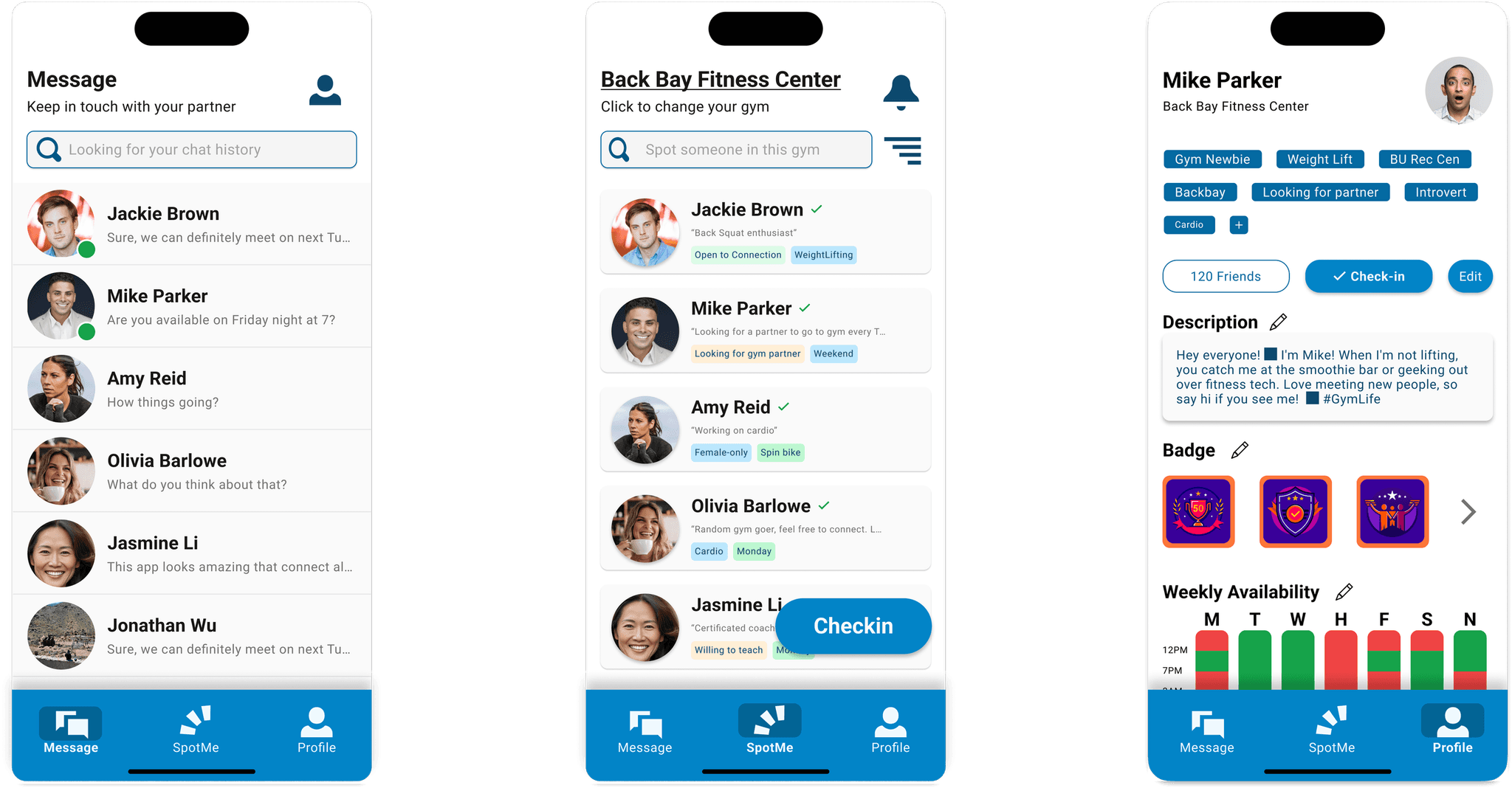
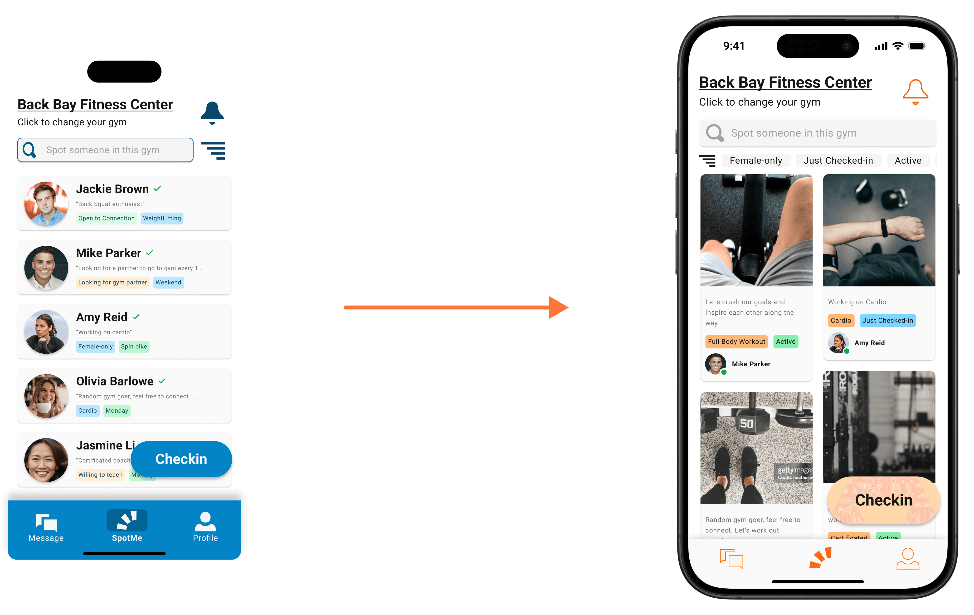
We created the first version of high-fidelity prototypes that was in color blue. However, it doesn't look very nice so I decided to iterate it in later phases.
Design & Prototyping
We created the first version of high-fidelity prototypes that was in color blue. However, it doesn't look very nice so I decided to iterate it in later phases.
Testing & Optimization
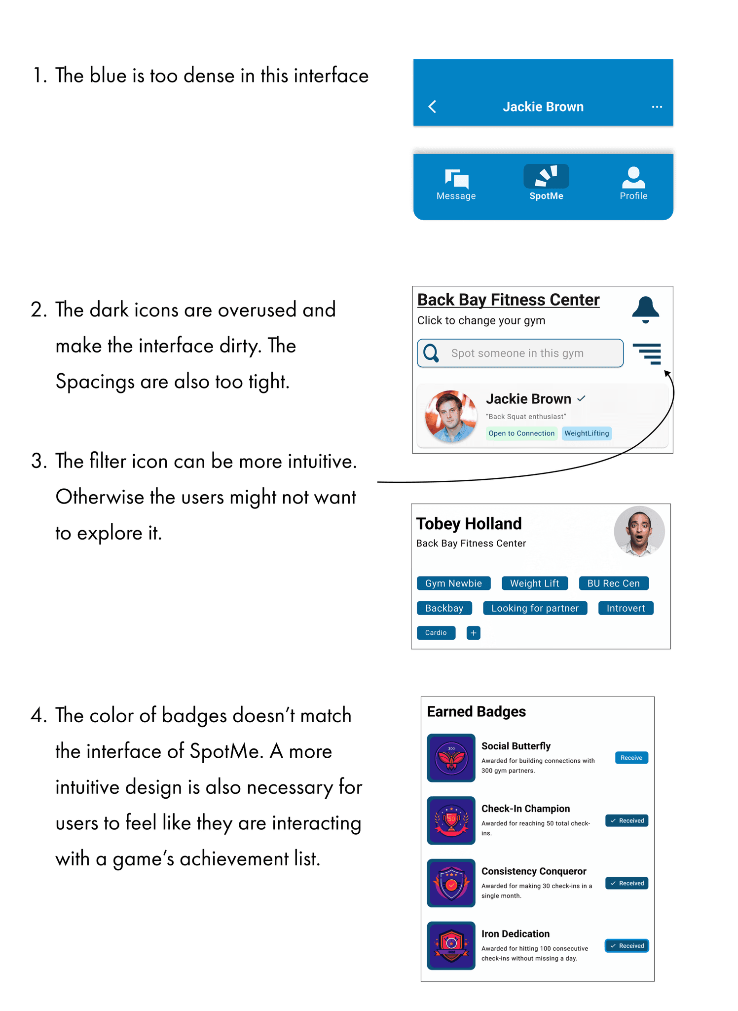
I found several potential users of SpotMe to conduct the first round of usability test that focus on the overall user flow and interface of SpotMe. And I collected some feedbacks from them:
Inappropriate usage of color.
The spacing of some main components
The display of filter icon
Identity Crisis
I also spearheaded the resolution of identity crisis, guiding the team's direction on better identity by creating a comprehensive roadmap to clarify objectives.
Design System & Local Variables
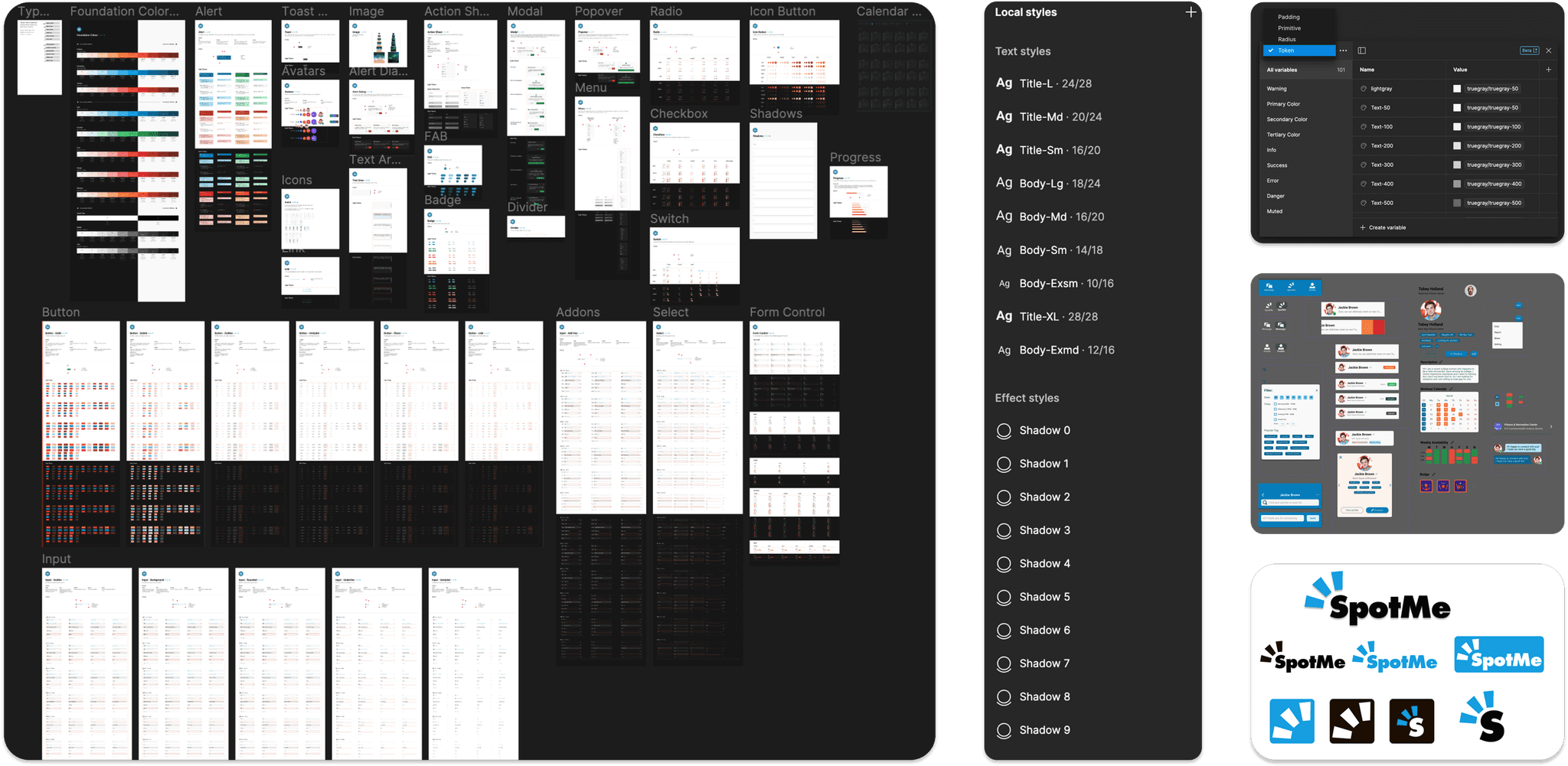
In order to organize the Figma file, provide throughout design handoff to the developers, and meet developer’s requirement on react native framework, I applied the NativeBase design system and structure our own design system and local variables. I also organized the components for SpotMe as well as its logo for variable versions.
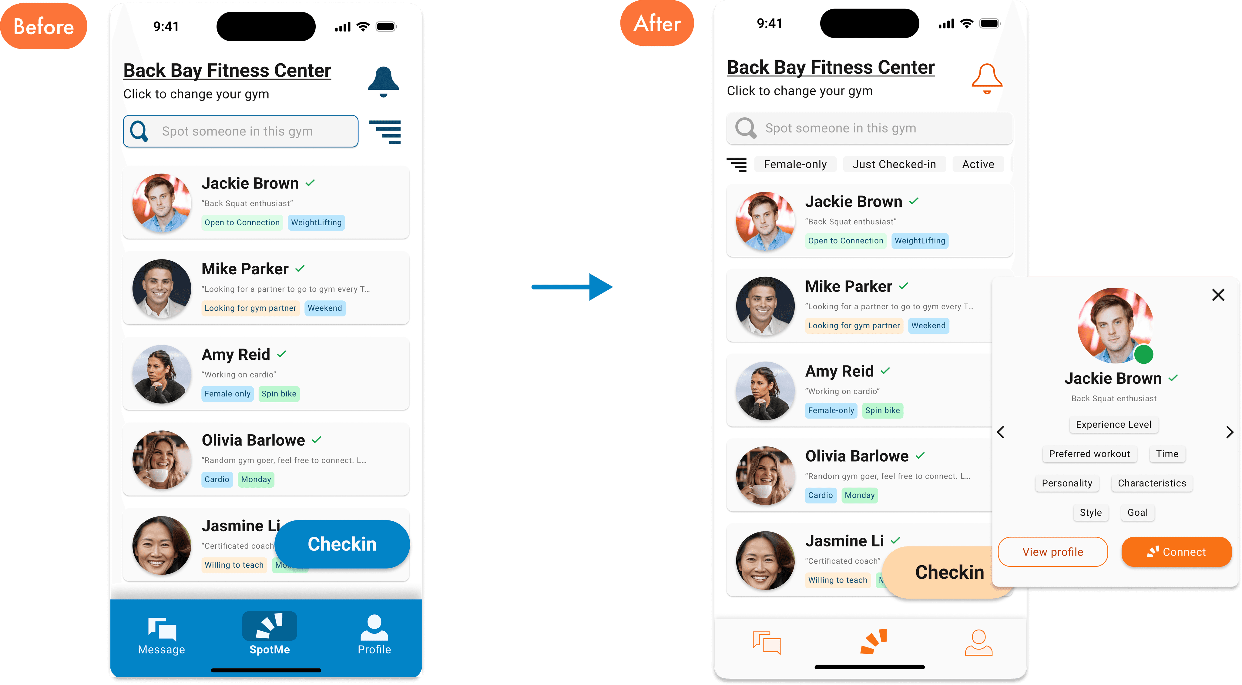
Based on the feedbacks from the first round usability test, I mainly focused on the interface and the choice of color palette and dedicated to make a better view of the homepage and the rest of the pages.
Iteration #1: Interface and Color Palette
The feedback I collected from the test participants about the interface and color are mainly about:
Inappropriate usage of color.
The spacing of some main components
The display of filter icon
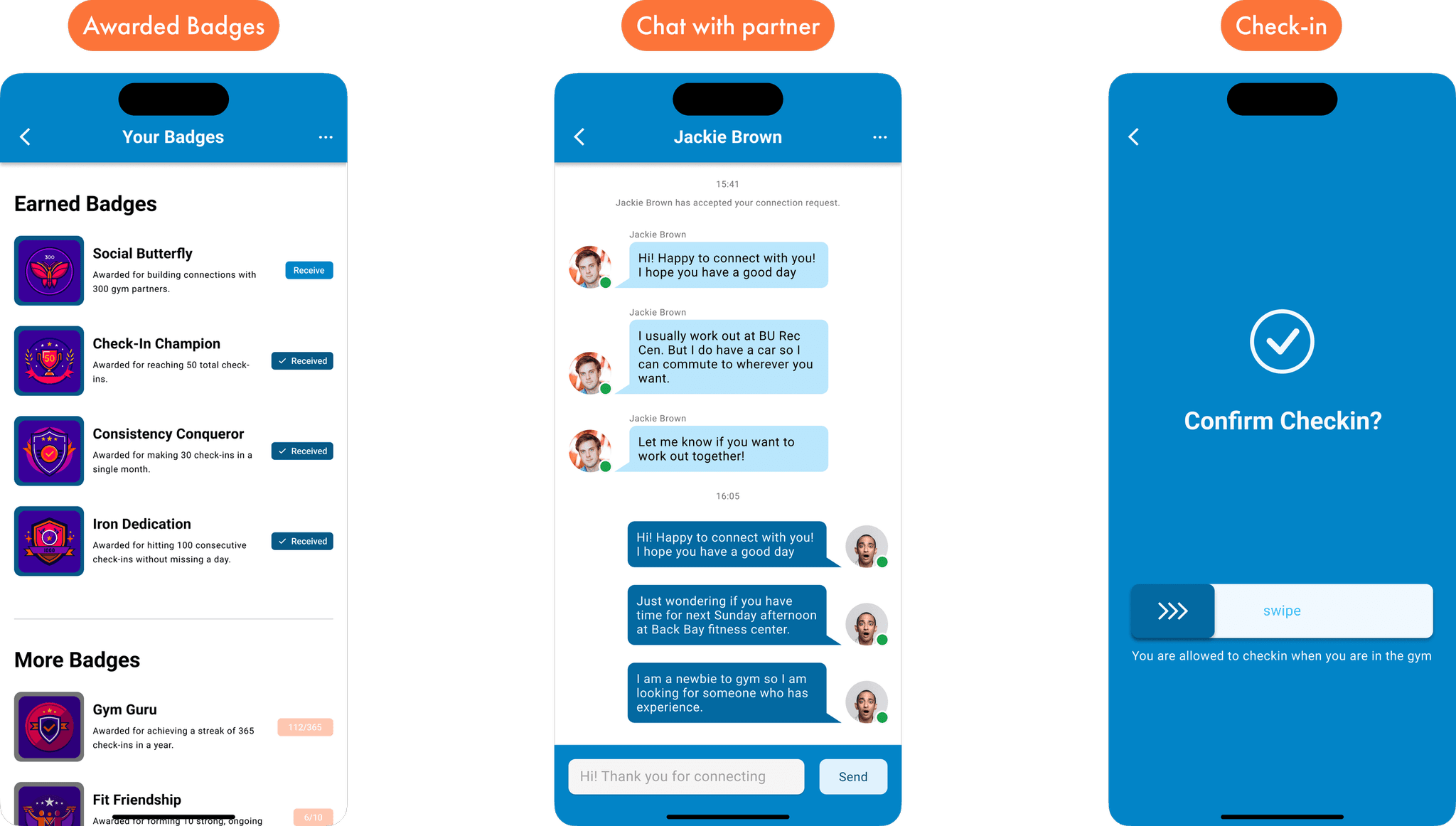
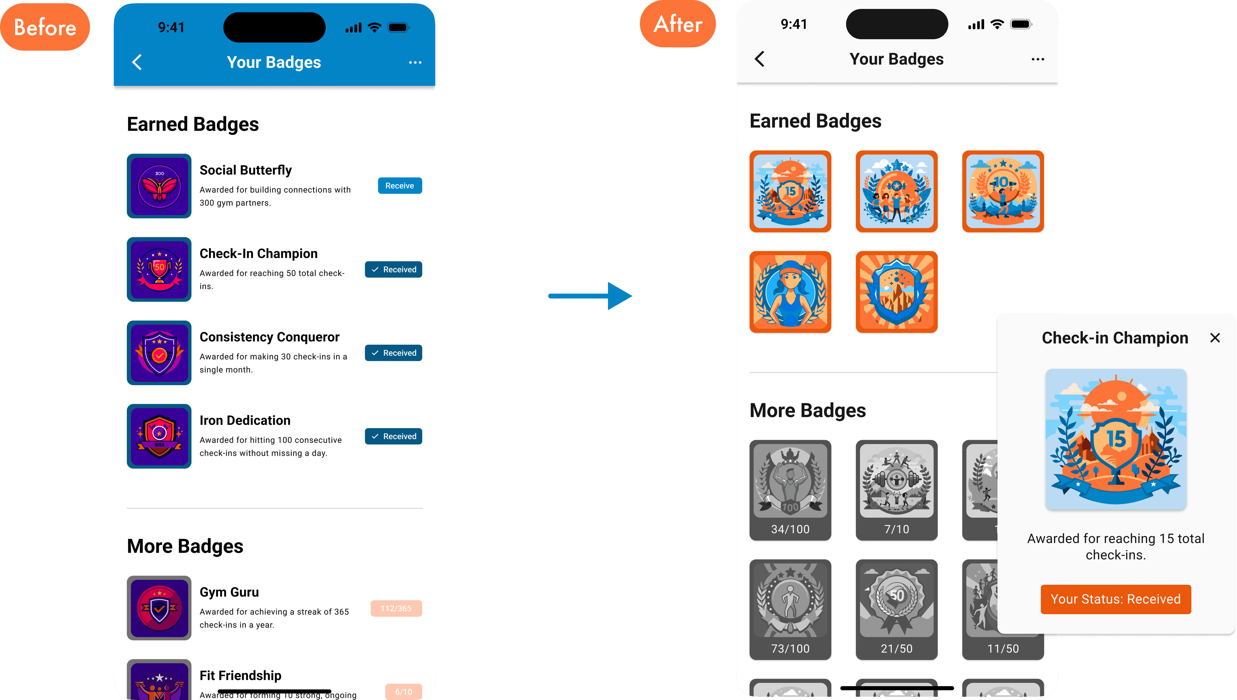
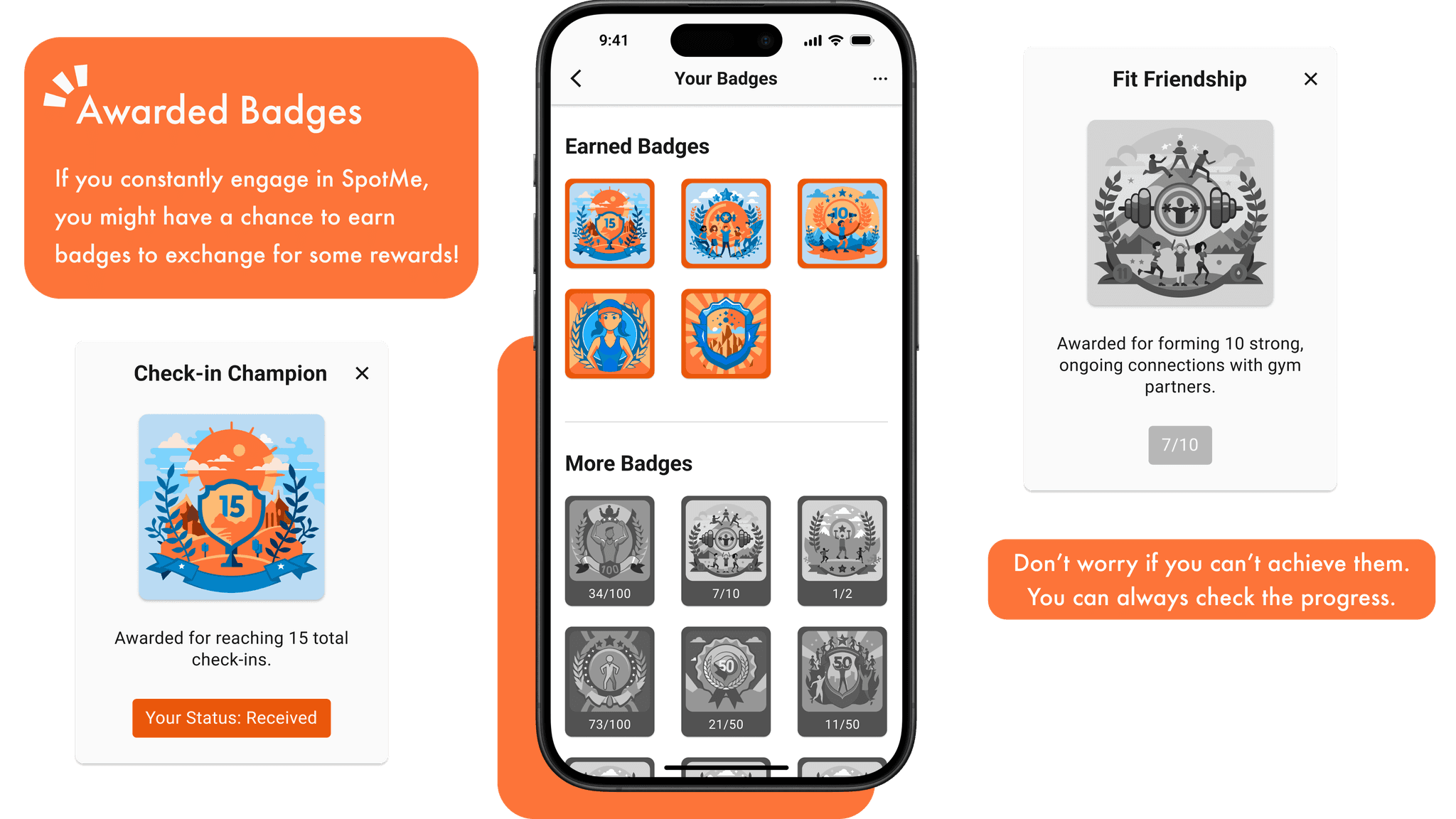
I reduced the use of huge color block and provided more breathing area for different components. I also redesigned the wireframe for the badge gallery with a newly added modal that can display the detail and current progress for receiving the badge for a more intuitive experience for the users.
By the way, I ai-generated all the badge and the title as well.
Iteration #2: The Connection Between Features
The second round of usability test indicated a bigger problem of the main partner connection feature.
First Problem: The Homepage (partner connection list)
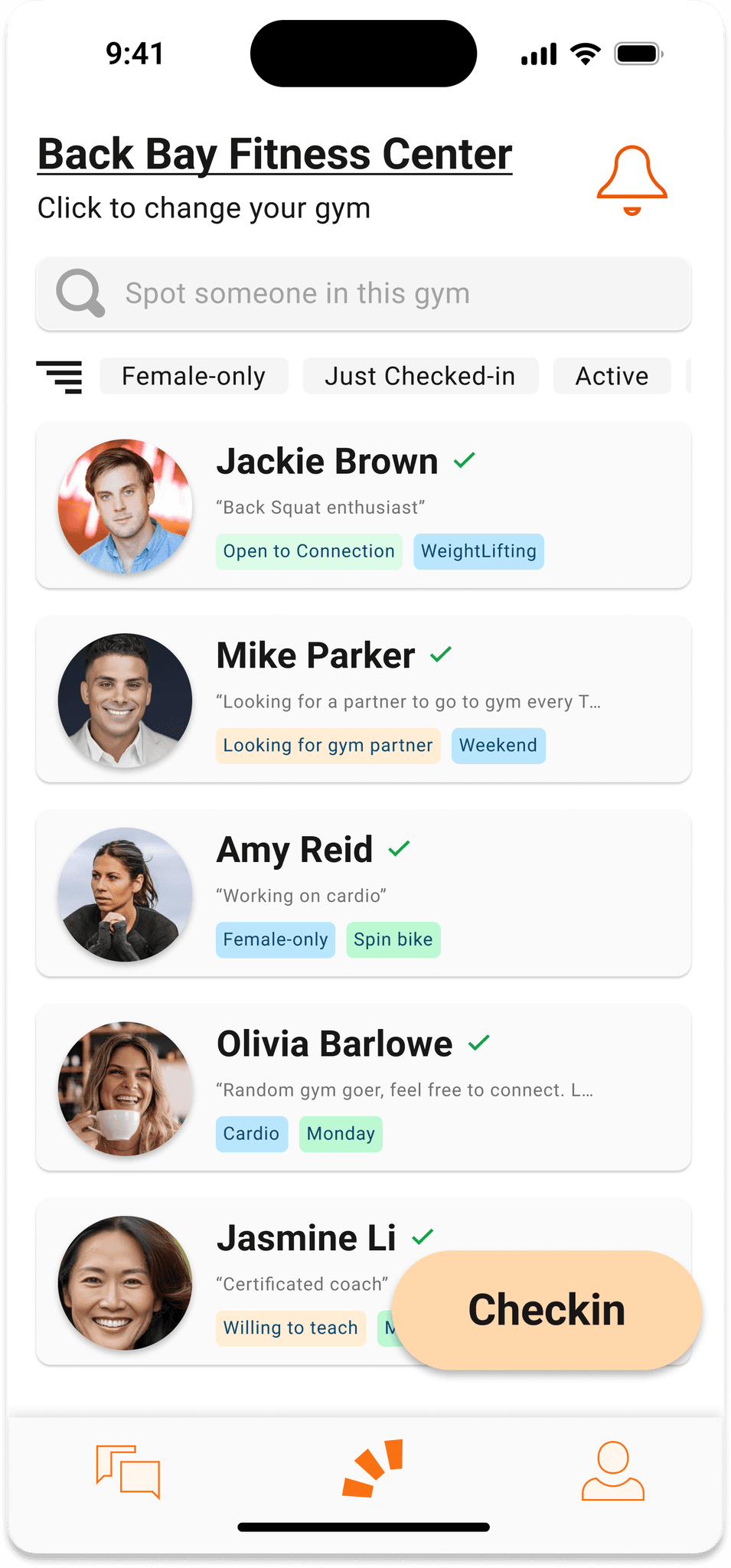
The partner connection list looks just like the message section.
The list doesn’t provide any useful information that motivates user to check profile and connect.
Is the name has to be in the biggest size?
Second Problem: The check-in button in the homepage
The user flow of check-in is not interactive at all and it is isolated to the rest of the features in SpotMe.
Doesn’t motivate the user to check-in before they start working out.
How do you know whether the user check-in at the gym or at home? Maybe some of the users workout at the gym with the same location as their apartment or hotel.
To solve these issues. I demonstrated the following thinking process
As a user, what is the criteria when select and connect with a certain partner?
Find a way to prove that the user check-in only when they are in the gym or when they are ready to exercise.
Let the user to reorganize the tag list and make it more intuitive.
And I concluded the following outcome for the second round iteration:
Users consider image and current status as their top criteria
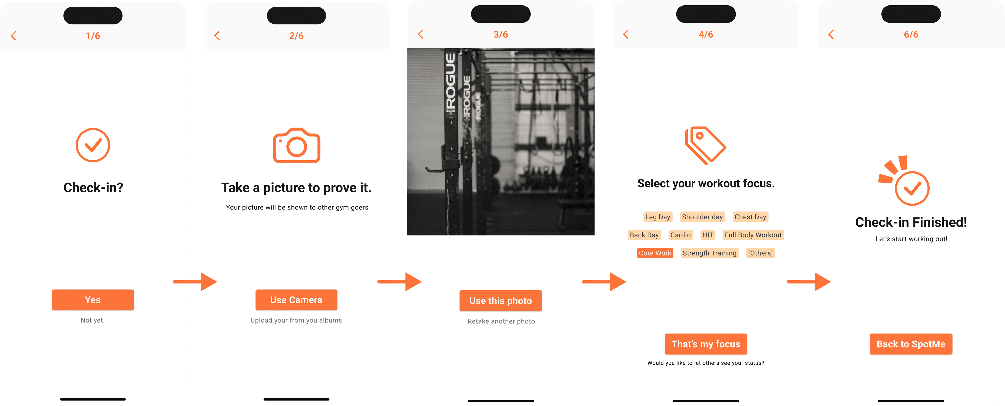
In the check-in flow, user take a picture to prove that they are in the gym.
Users also want to know if a gym goer is in the gym, what they are working out so they can decide to connect or no.
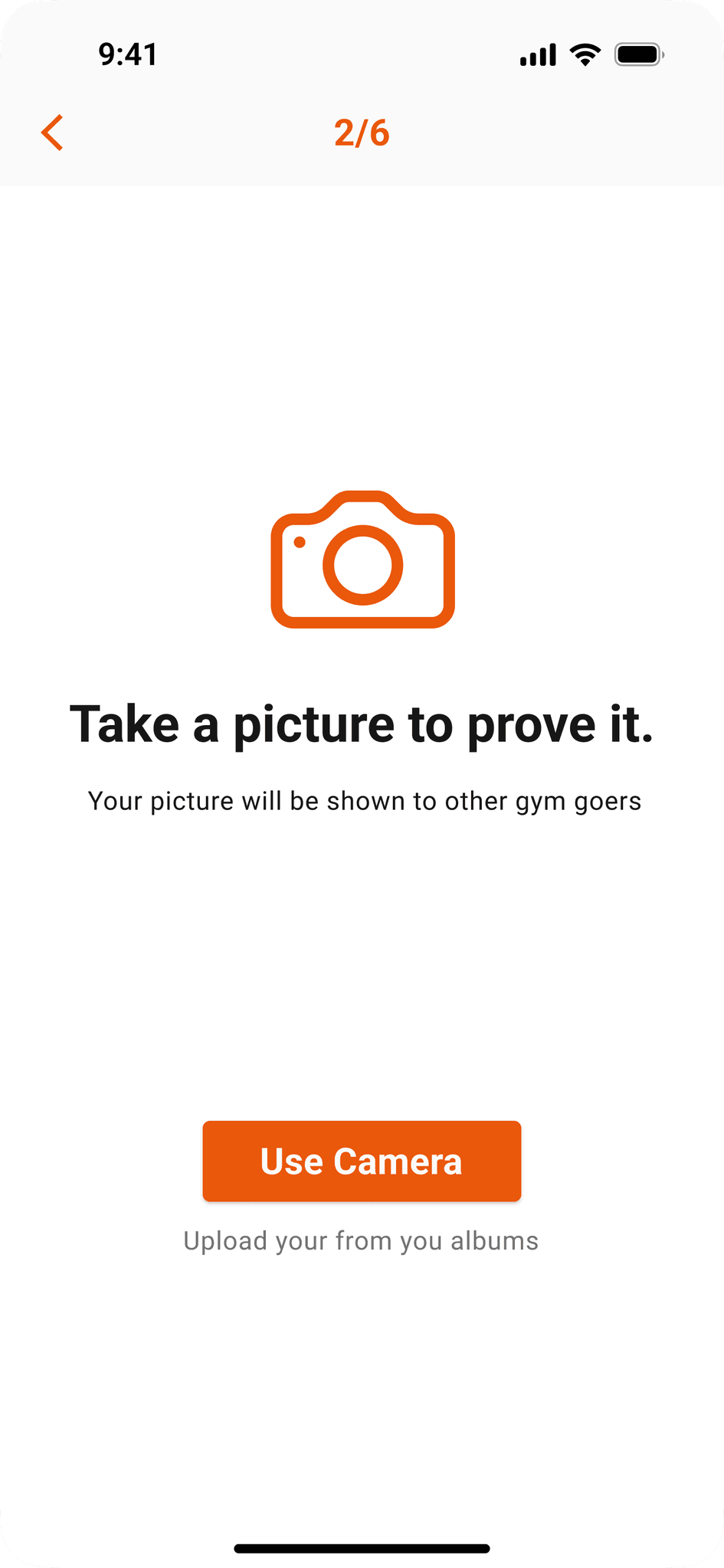
After the second round of the usability test, I added the “taking picture” feature as part of the check-in flow so the user can prove that they are at least in the gym or they are working out.
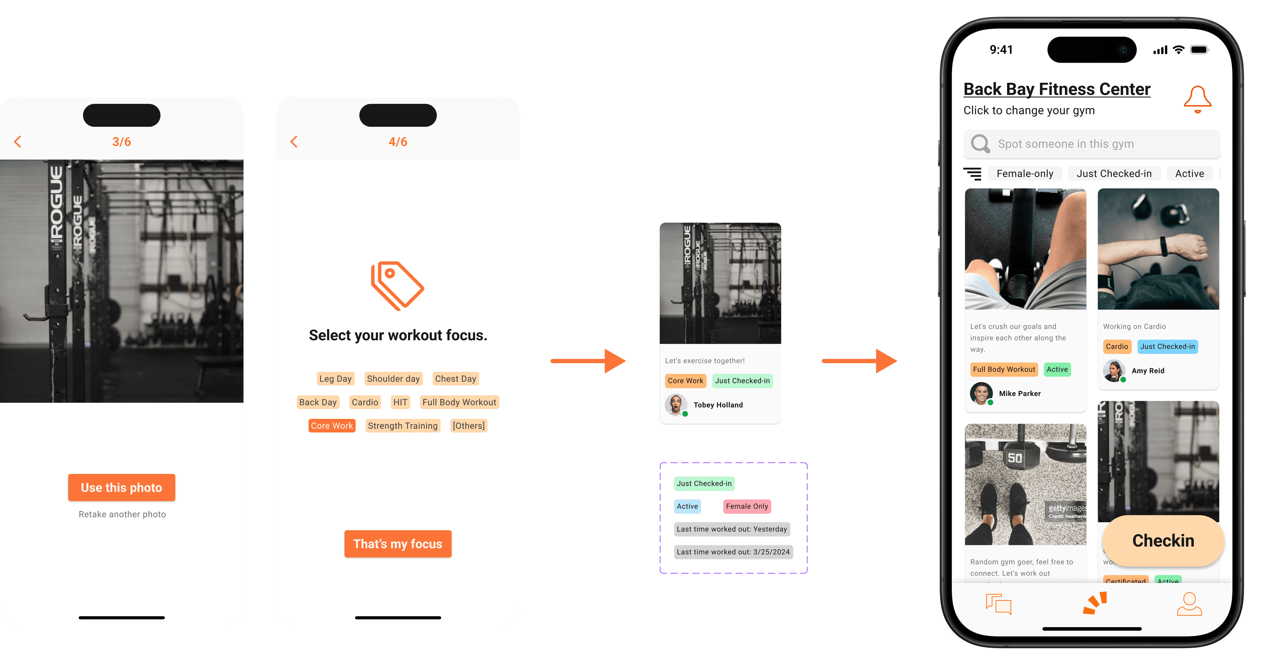
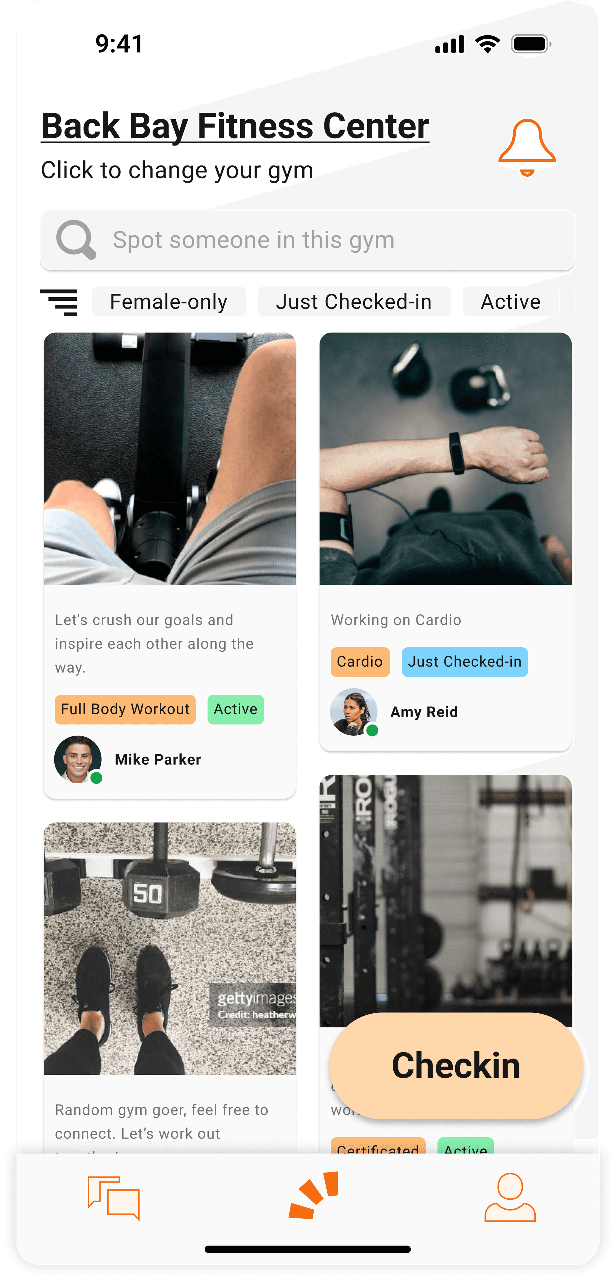
After the second round of the usability test, I think it will be more connected and more interactive if I can find a way to make the check-in feature less isolated. So I built a connection between the content shown in the partner connection page and the check-in flow.
When the user is checking-in, he is asked to take a photo to prove their present at the gym and to select one tag for their today’s workout focus. After the iteration, the photo and the tag will be the content shown in the homepage.
In an individual card, the first tag is the user’s workout focus for today, the second tag will be the user’s current status. The photo will be the one that is taken when the user is checking-in.
This is the second version of the high-fidelity prototypes. It will also be the one we will submit as the minimal viable product for final demo presentation. I conducted another round of unmoderated tests among users and received a 73% increased rate of positive experience compare to V1 prototype.
This opportunity to work with four excellent developers is a valuable experience to me. I have a chance to work with a team for a collective product. The experience not only gives me an opportunity to improve my communication and collaboration skills but also force me to develop more practical skills in product design.
User-centric is the KEY
Always design what user needs and always make sure to think about what user wants before making any design decision.
Communication plays the role
With users;
With developers;
With clients;
With myself;
Documentation
Next time, force myself to make copy and document every new adjustment.
