Event Insurance Platform
Streamlining Event Insurance Selection Flow for Less FAQ Calls
Role
UX Design Intern
Duration
2 months
Tools
Figma, Miro, Usertesting.com, Jira.
Team
Product Manager, Researcher, Developers, FestShield manager.
25%
Increased in users locate FAQ info by themselves
40%
User Retention
"Zekai is great at systematically outlining his thoughts and gets along great with other members of the team."
[Department Leader]
"Zekai provides a new innovative perspective in improving the user flow that no competitors have done before."
[Department Mentor]
FestShield is an event insurance platform that allows users to obtain quotes for coverage of various events and their attendees. Recently, FestShield team has received a lot of customer support calls from the users for simple questions that suppose to be easy to find. This kind of customer service calls is usually defined as "Low Complexity Inquiries (FAQ Calls)"
In this case, the 2 reasons of too many FAQ calls are poor user experience when selecting the event for quote and navigating within the insurance application.
The GOAL of redesign is to reduce the FAQ calls by improving the user experience and making information more accessible on the website.
Background
FestShield's original platform suffered from large number of FAQ calls that is caused by poor user navigation and event selection experience.
Users struggled to identify and select appropriate event types, leading to confusion and increased reliance on customer support. The redesign project was initiated to streamline the user flow, improve event categorization, and enhance the overall user experience of the insurance quote process.
My Contribution
In my first internship project, I reviewed the initial process touchpoints, conducted competitive analysis, and used data insights to optimize the pre-insurance application experience for FestShield users.
My A/B test proposal was implemented and received positive feedback from both the FestShield team and the design team.
Even though we came into disagreement in some design decision, I managed to persuade the team to go for my design by providing validate data set, feedback from test participants, and competitor analysis.
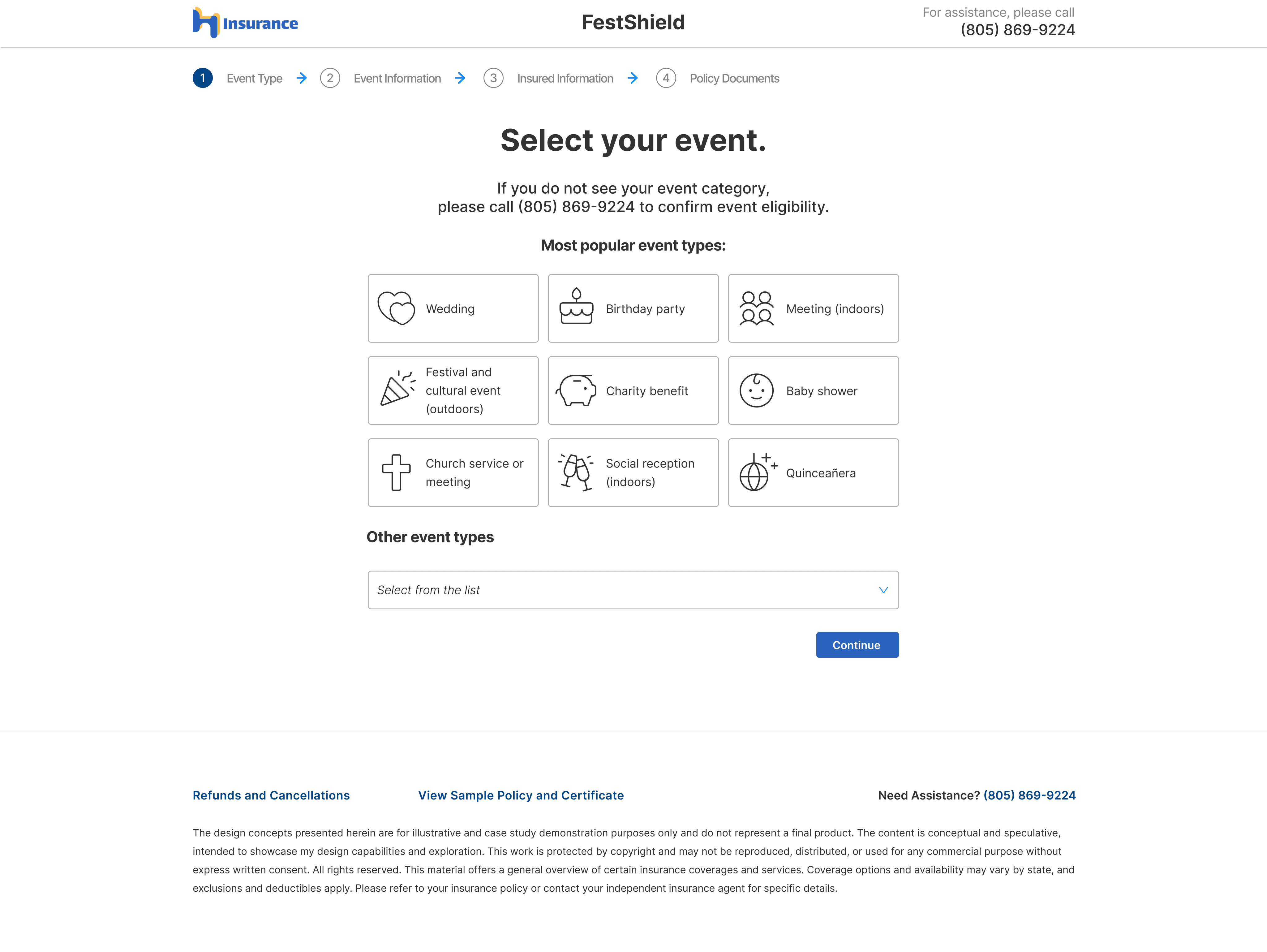
The original Design (PArt 1)
Problems like identifying specific event, gathering information, and scrolling down from a long list of other event types lead to confusion, time-consuming searches, and potential customer loss, ultimately harming the platform's effectiveness and user experience
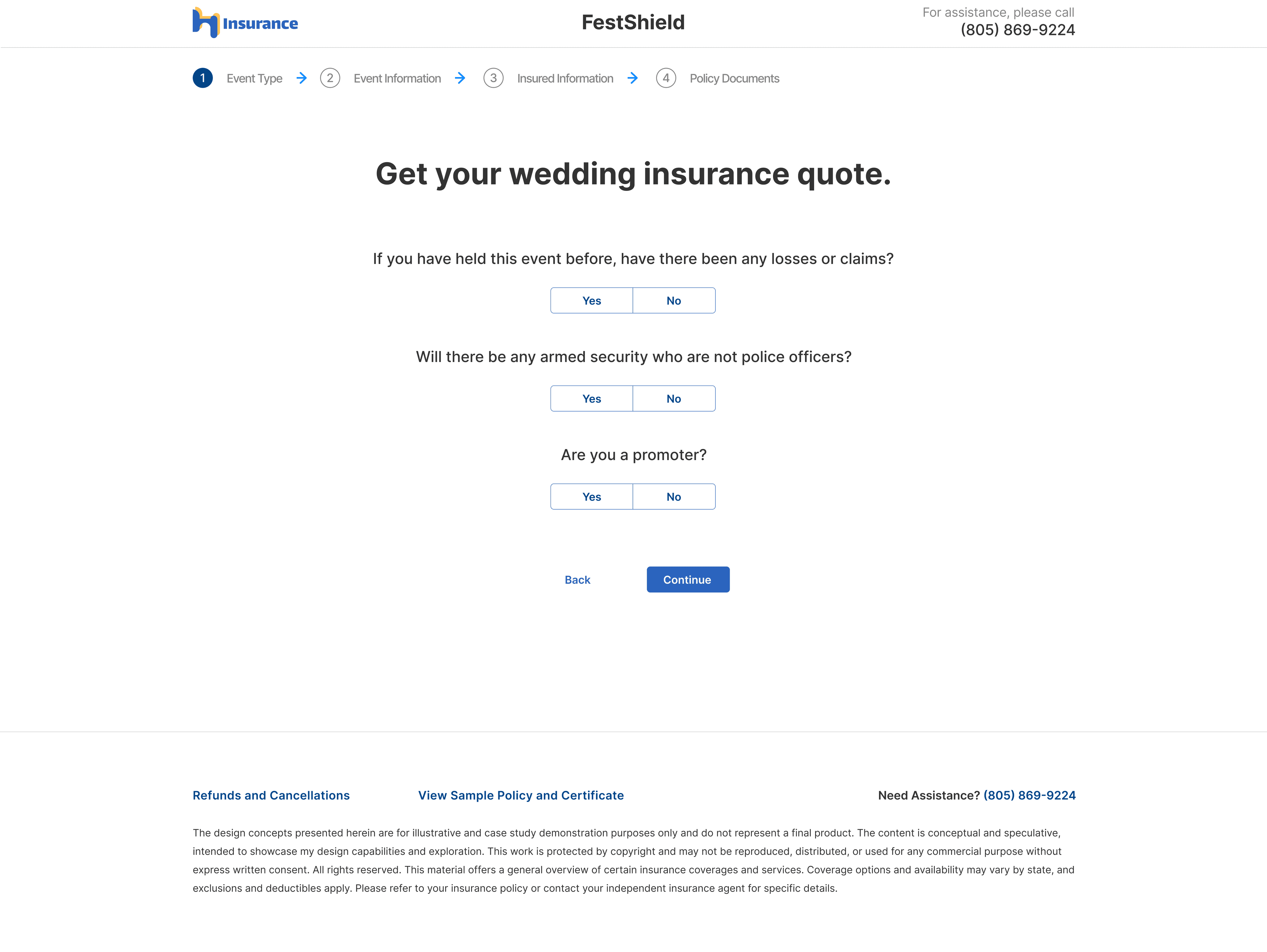
The original Design (Part 2)
Users are having a hard time to know the eligibility of a certain event. Even though there is already several toggles in first step part 2 that ask users whether their events include certain things that is not covered, users do not know if there’s some other things that are also not eligible.
Users of FestShield need to call for customer support frequently because they struggle with event selection, understanding eligibility criteria, and finding essential information like phone numbers and policies.
Three pain points below are the main reasons FestShield users make the call:
Pain Point 1
Event Selection Confusion
Users have difficulty identifying and selecting the appropriate event category, especially for less common events, leading to misclassifications and frustration.
Pain Point 2
Inadequate Info Accessibility
Essential details like full eligibility lists, refund policies, and customer support contact information are not easily discoverable, causing users to struggle or abandon the process.
Pain Point 3
Inefficient User Interface
The time-consuming dropdown menu for "other event types" and the inconspicuous search feature, hinders users from quickly finding their desired event and completing the quote process.
To reduce the frequency of customer support call from those confusing users, we the UX team and the FestShield team got together to conduct a series of research and redesign.
Unlike a regular design process, the FestShield project has a lot of back-and-forth communication between our UX team, FestShield team, and the underwriter team. By the end of the design process, the dev team also provided some insights.
Research & Planning
The FestShield team conducted usability tests and analysis to identify key user pain points, including event confusion, unorganized categories, and inconspicuous callout banners.
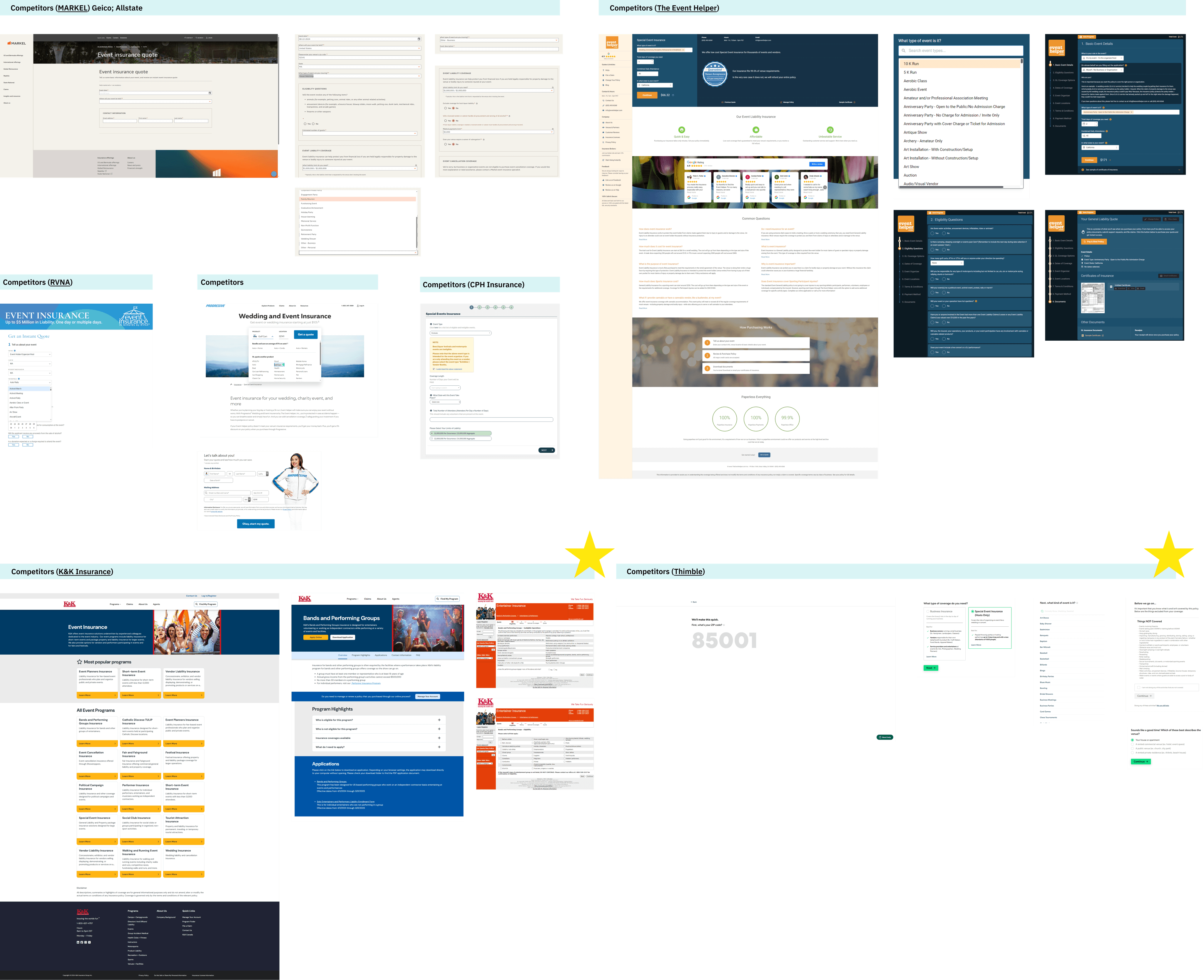
I researched competitor platforms and summarized key takeaways that could be implemented on the FestShield platform to address identified issues.
However, I couldn't find a good reference among all competitors about a good solution for the improvement of "Other event types" selection flow.
First Round Design
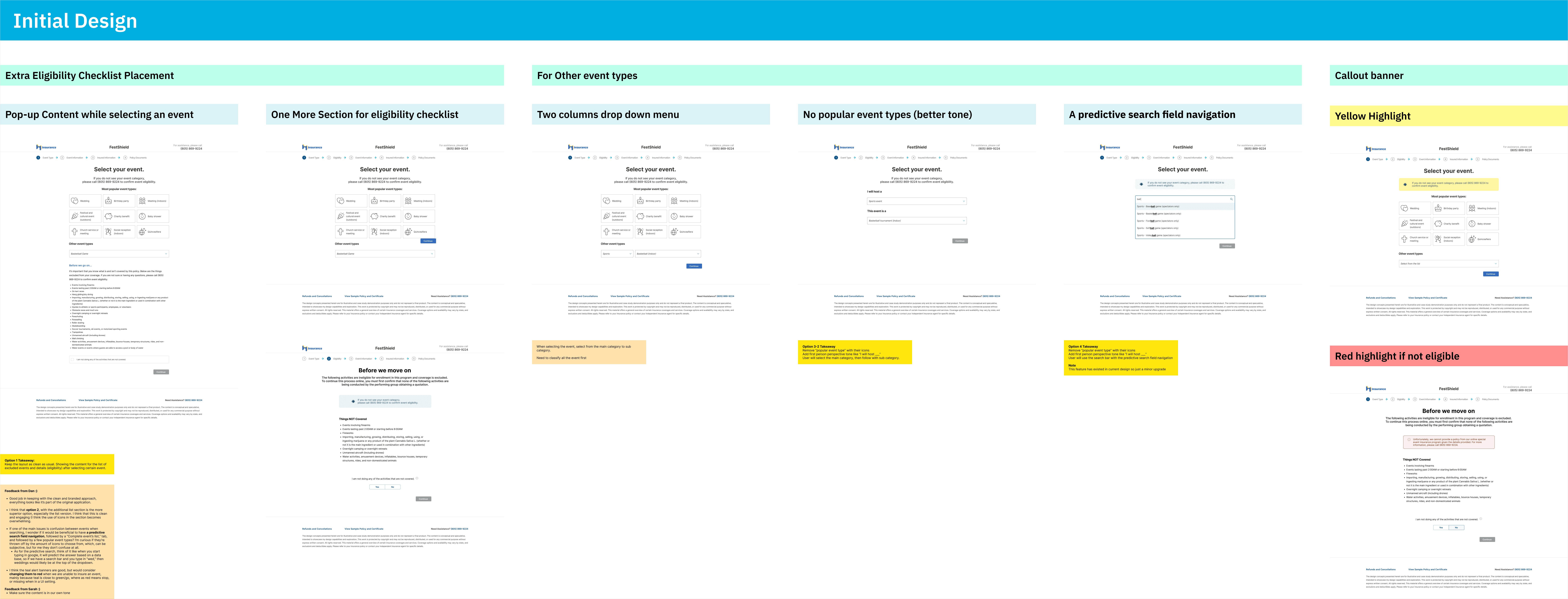
I created multiple versions of the redesigned website on Figma, targeting the identified problems and incorporating a new feature requested by the FestShield team.
Stakeholder Collaboration
Regular meetings were held with the UX team and FestShield team to discuss and decide on design versions and new features. I also checked in with the dev team to assess the feasibility of new features and noted potential development barriers.
A/B Testing
We conducted an A/B test with 12 participants to evaluate two versions of the new design and collect feedback on all redesigns.
Iteration
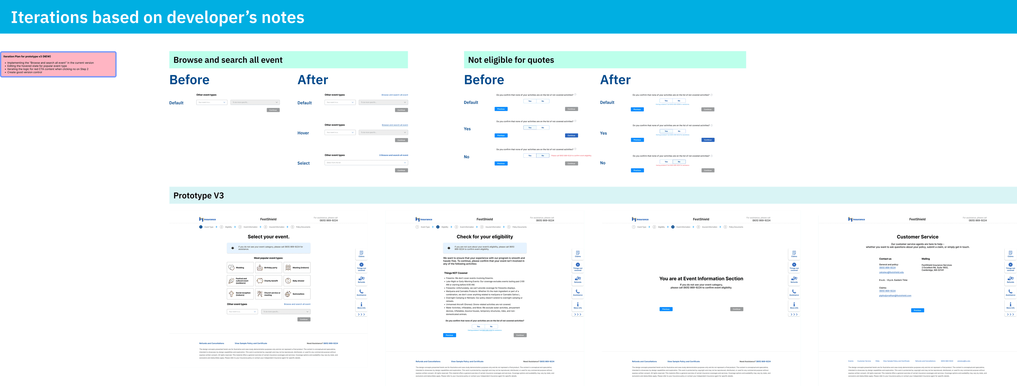
Based on A/B test feedback and developer input, I created a refined version with a cleaner prototype.
Final Documentation
I documented the entire process, created guidance and anatomy documents, and wrote necessary notes before the end of the internship.
Feasibility
There are many technical and legal situations that make me unable to achieve my idea.
Some of my solutions contain more written works than design works like creating lists of eligibility check for different event or recategorizing the “other event types” or making list. So every time when I come up with a new idea, I will check in with FestShield crew to confirm its feasibility.
There was only one column at the "Other event types" section with all events list together in alphabetical order. The new two columns needs to recategorize into major event category and sub-category.
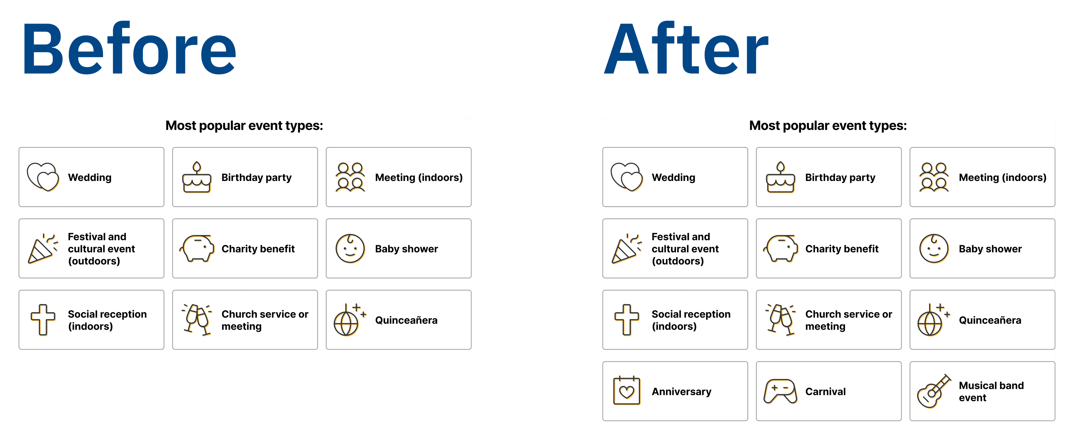
What's more, during the A/B test, 5 participants expressed disappointment when notice that the event they want to get quote is not part of the “most popular event types” because they have to spend extra amount of time and actions to identify from the “other event types”.
To overcome this disappointment, one of the iterations I made is to add an extra row of popular event type. So the number changed from 9 tiles to 12 tiles.
However, the dev team told me that the iteration on extra popular event types require back end modification so it's not something that they can accomplish in short-term. So I only can change it back.
Balancing Ideas
As a cross-functional team with different people, I faced many design ideas that based on personal preference instead of user-centered design every time we met as a team. I have to spend extra amount of time to use research and existing theories with multiple design options to persuade them.
Preference vs. User-centered
For example, the stakeholder insisted sidebar that is filled with blue color because she thought this obvious highlight will attract user's attention if they need any assistances or any external information.
However, I suggested the reason a sidebar is called "SIDEbar" is that it's on the side instead of right at the middle, which means it doesn't need to attract user's attention and even make the user to ignore the main content.


Limited Time Period
Before the final documentation, I met with the dev team crews and they provided me with some issues on my "final" design that are related to the user's logical flow. Even though my solutions and iterations based on dev team’s feedback were accepted by them, I believe it is necessary to have another round of the usability test to validate my new iterations. However, my internship ends after I finish my final version.
There were two main iterations in the project: The first iteration happened after the A/B test conducted and the second iteration happened after a round of check in with dev team based on the feature's feasibility.
Prototype Improvement
The prototypes for A/B test are made in an old-school way. I connected wireframe with wireframe to indicate one minor interaction, which causes a lot of loading time because each prototype has more than 30 wireframes.
The new prototype only has three wireframes (First step, second step, and a example third step) plus the customer service page. All interaction with the dropdown menus and the different states of continue button are all applied with conditional interaction by using local variables and component sets.
Prototype V1
Prototype V3 (Final)
"Other Event Types" Improvement
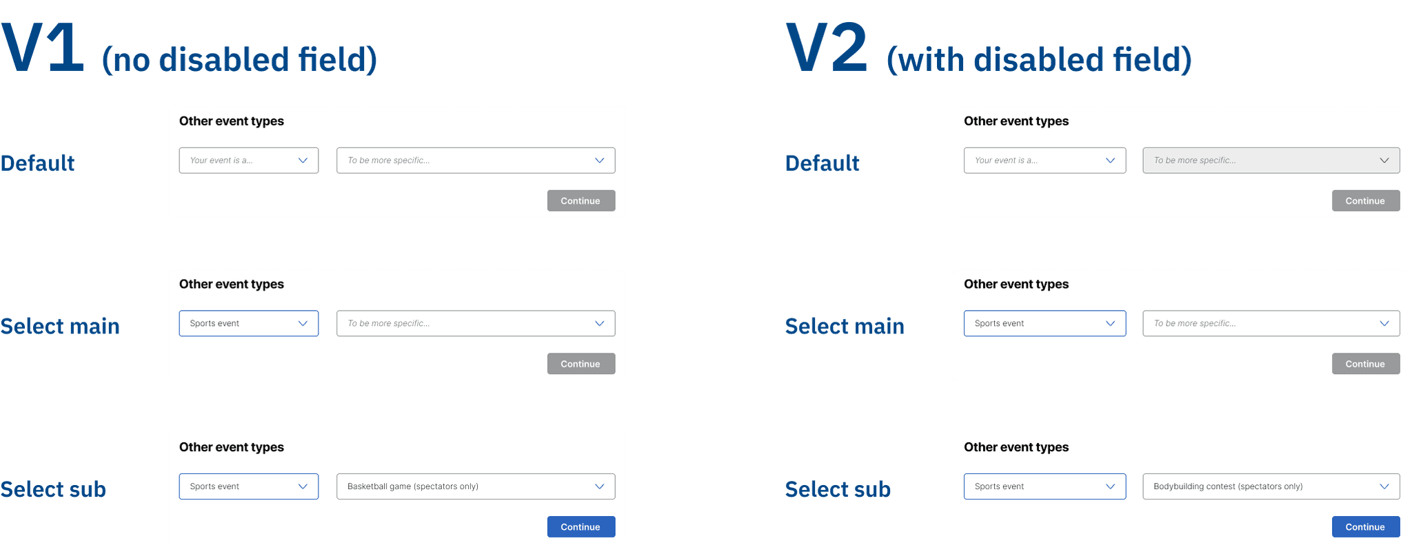
V1 to V2: On the prototypes we used for A/B test, there is no clear indicator when to interact with those two dropdown menus. So I made more intuitive boxes to indicate whether it’s clickable or not (active state and disabled).
V1 to V2: Dropdown menu selection order
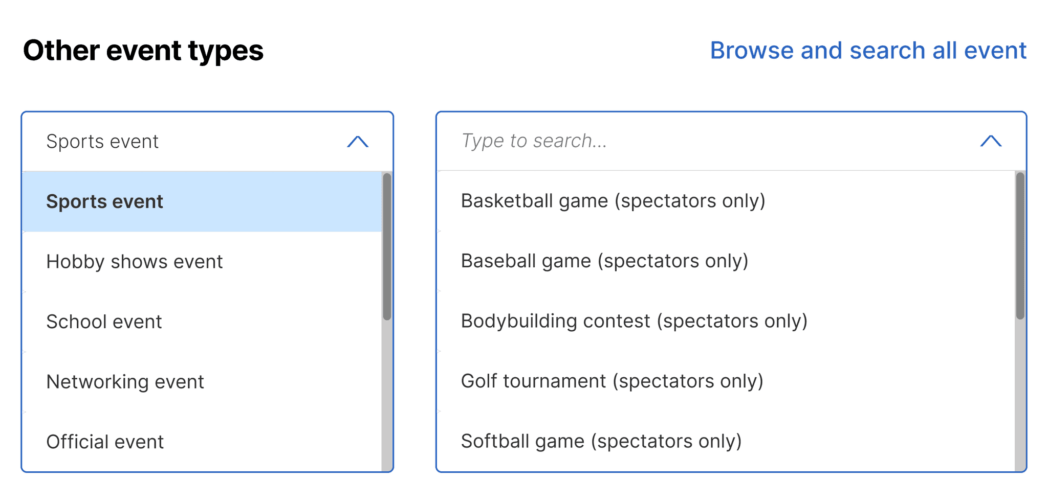
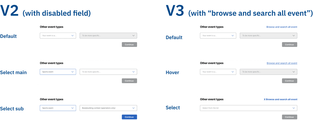
V2 to V3: Originally, when the user clicks and expands the other event type, they can see a sentence indicates that they can click the bar and type to search.
After the iteration, there will have two dropdown menus. It is confused for developers because:
"Developers don’t know if both two menus need searching feature. If both of them need, what to search. Isn’t it confused the users because there are two searching bars provided"
What’s more, some users from the usability test that was conducted before my redesign also provide positive feedback on the original single dropdown menu, the new double dropdown menu might more be intuitive for some users.
So, I added a switching CTA to let users to decide their preference in using the single or double dropdown menu. And users will see a typing indicator once they click and expand either main menu or the sub menu.
V2 to V3: Switch to Single Column
Content Rephrase
Rephrase the check-box text on the Event Eligibility page to “I am not doing any of the activities listed above.”
Before
After
Yes/No Selection Improvement
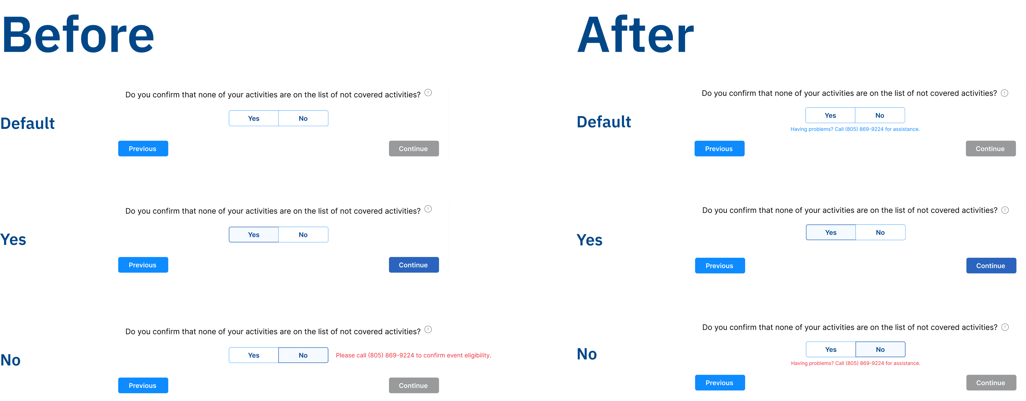
This is a design that I have already made in the first round of the design: users confirm their eligibility and click yes, but they don’t meet the requirements and click no, there will have a red call-to-action content that let them to make a phone call to negotiate or to reconfirm. However, according to the back end data, if users are not eligible, they won’t click no, they just exit the page when they found out they are not eligible.
So, instead of showing the red content when click no, I make it to be visible all the time and change its color to red when they click no.
In the new second step, if users are not eligible, they won’t click no, they just exit the page when they found out they are not eligible.
Progress bar
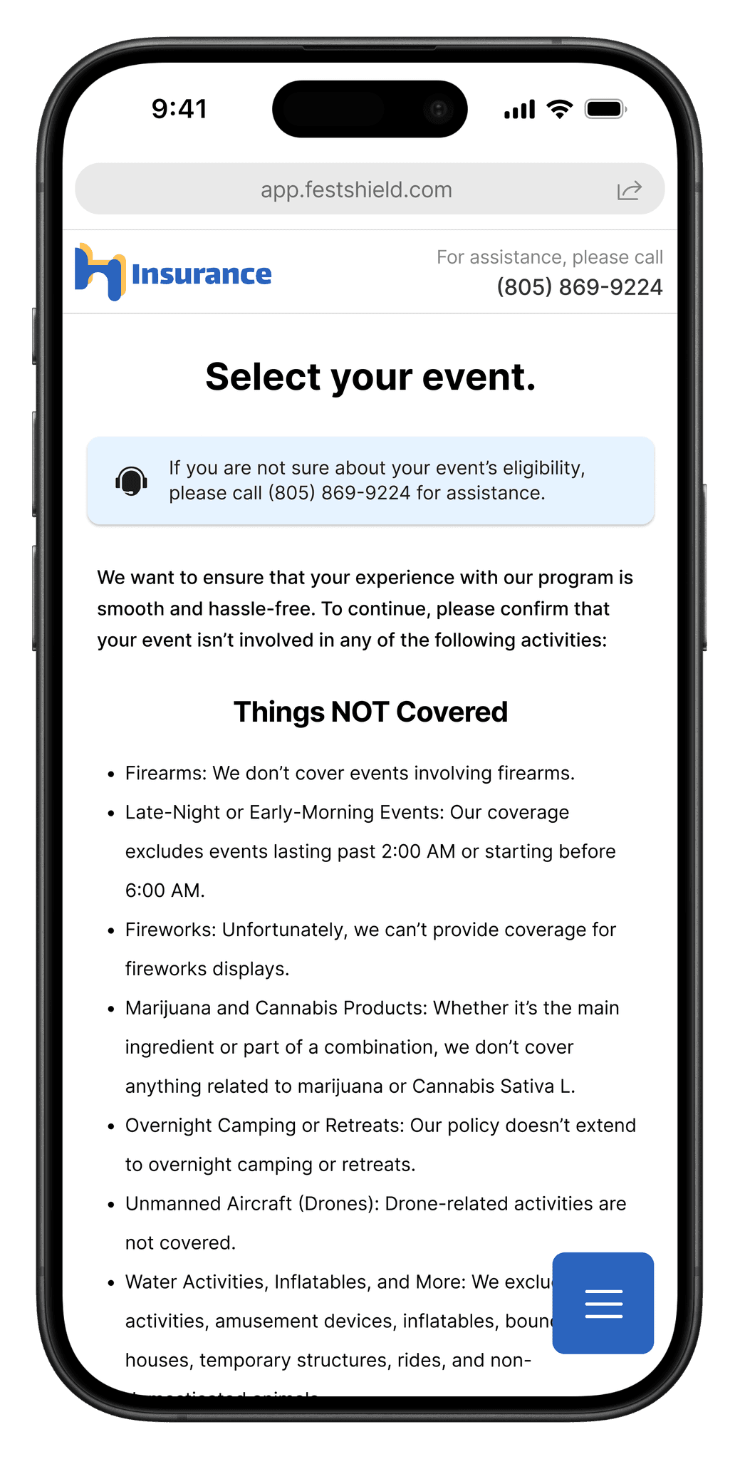
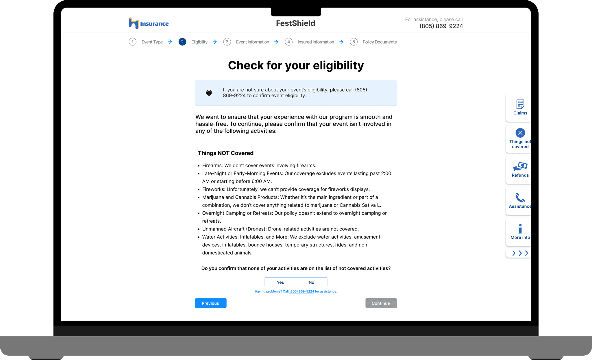
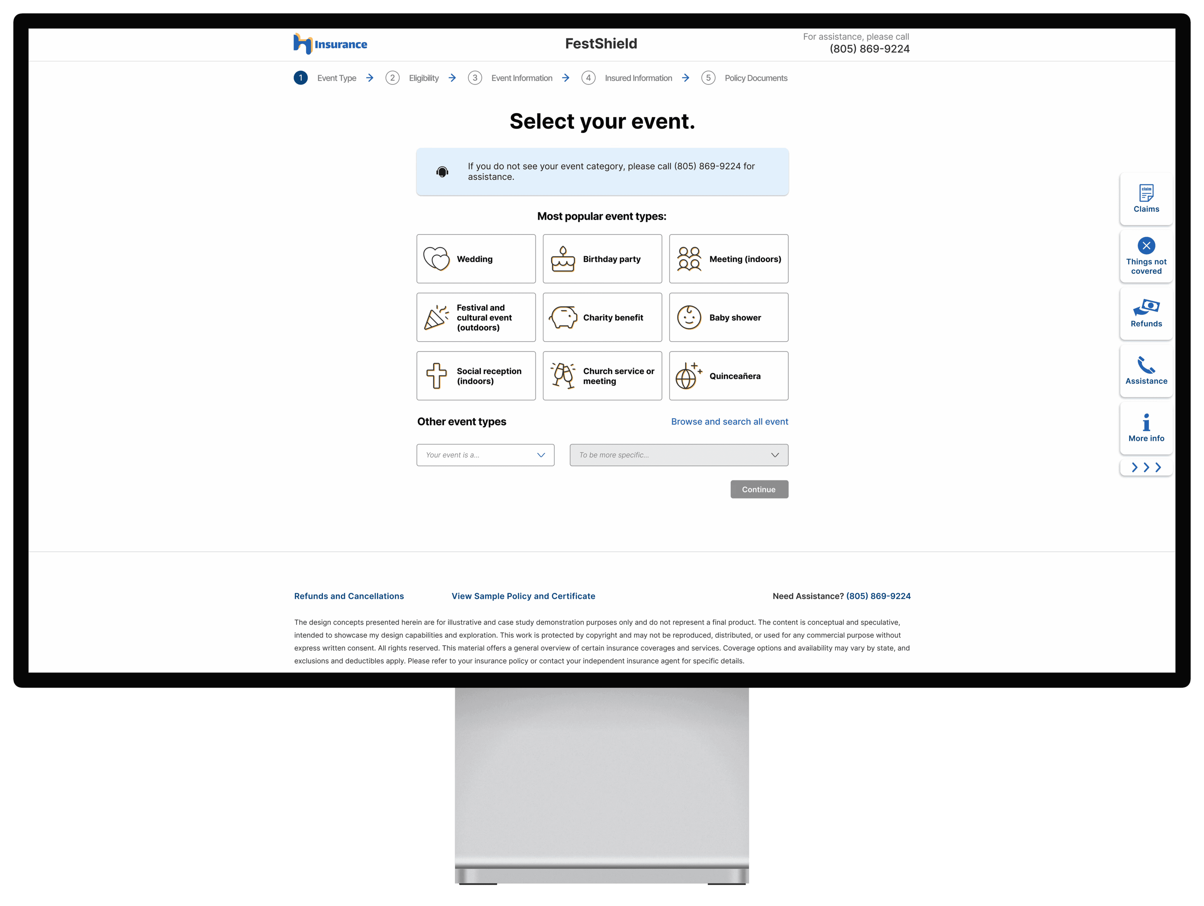
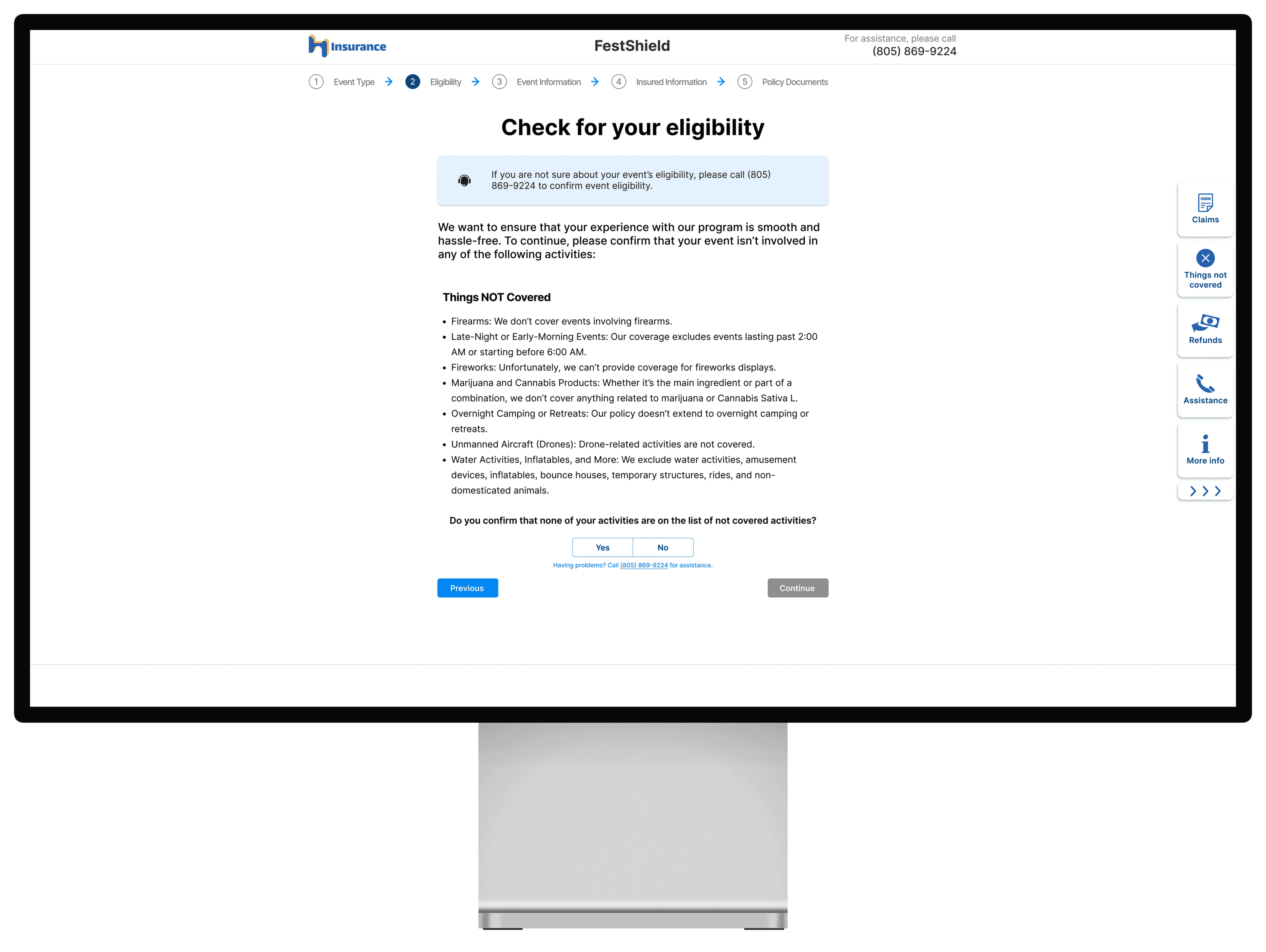
New eligibility checklist for less confusion on event eligibility.
Callout banner
The new callout banner makes users to easily be aware of the phone number so they know to make a phone call when having trouble.
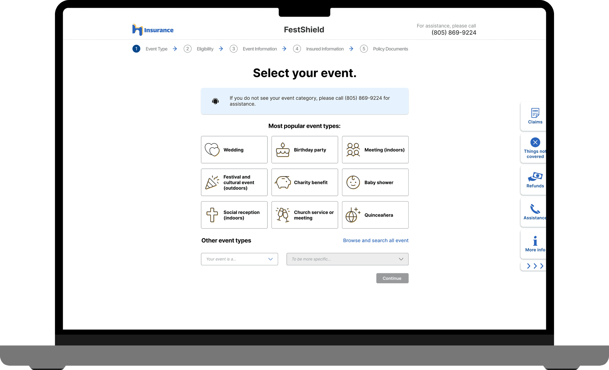
Most popular event types
Nine tiles of popular event types that can hover to expand for event description that improve event selection experience. Users reduce the number of clicks to confirm their intended event.
Other event types
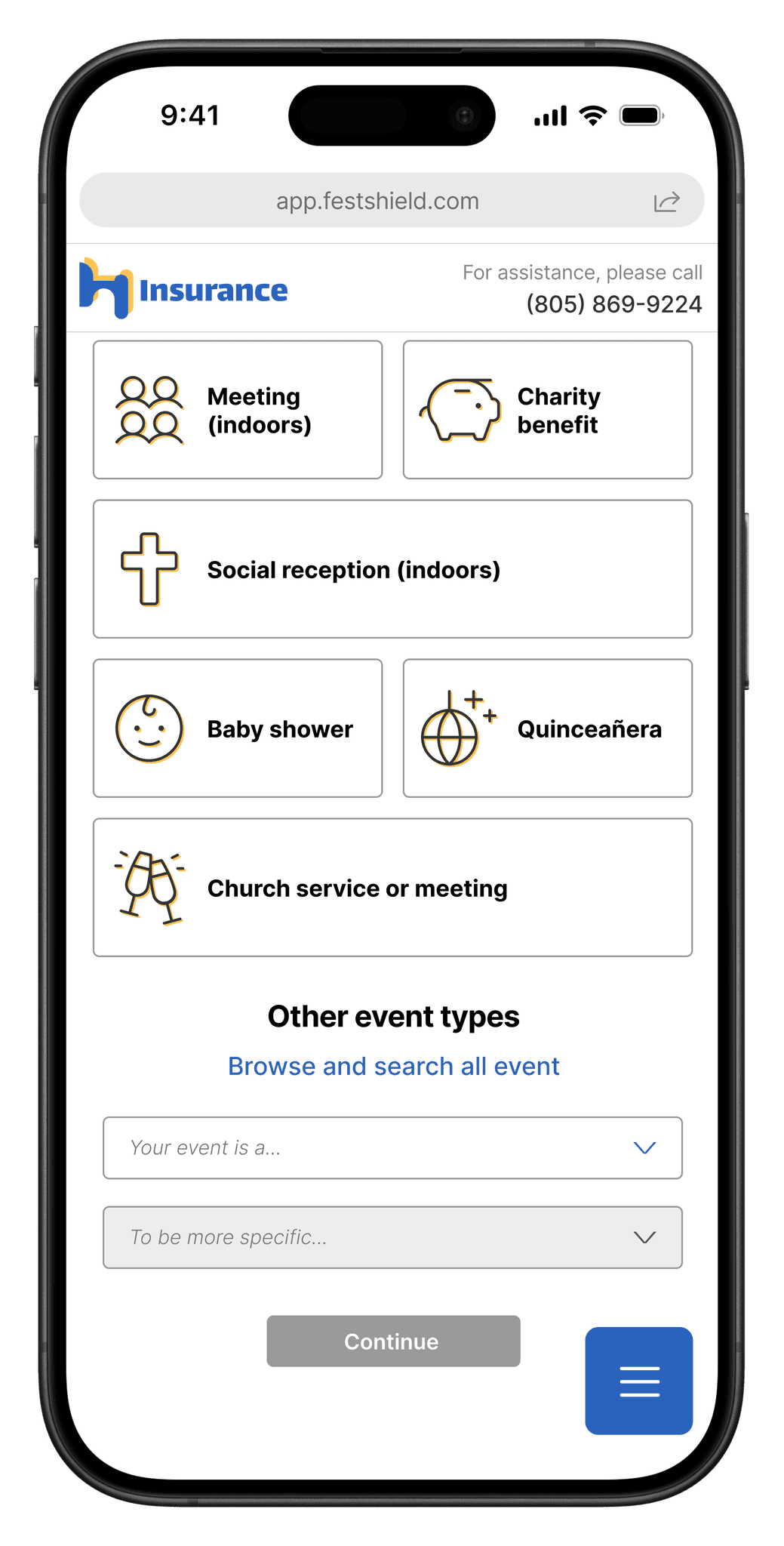
Two new searchable dropdown menu that reduce scrolling and searching time for users who need to select a event outside of popular event types. The sub menu will be enabled only when a choice is selected in the main menu, which will provide clear process for users.
Sidebar
A collapsible sidebar that intuitively merge into the page with all necessary tools and external links for users to seek for more information that can benefit their experience.
Yes/no toggle for eligibility checklist
Better wording to avoid grammar confusion. A reminder for users to make the phone call and seek for assistance even before clicking no and exit the page.
Desktop version and mobile version help users to enjoy the same quality of services even with different devices.

Emotion matters
User’s emotion plays an important role in our design decisions. Thanks to some participants who shared their feelings to us when finishing the moderated test.
User-centered
This is the first time for me to work on part of the entire flow.
When I was communicating with fellow designers, stakeholders, legal crews, and developers, even though I have heard a saying of sacrificing some of my beautiful design ideas for the level of workload and time-consuming, during this project I truly learned and realized the importance of creating the balance between the ideal design and the real landing work.
As a designer, users are the top priority, but we also have to empathize with other teammates who are trying their best to bring our design prototype into a real thing.
Be confident
As an individual who is born in a conservative family environment, every suggestion and recommendation that I had made is a challenge for me, especially when I am still a entry-level designer who is dealing with a real-world project for a big company.
Luckily, with the help of my supportive colleagues, I am going out from my comfort zone and trying to express my ideas more than ever before. And it turns out that there’s nothing to be afraid of, especially when you are fully prepared for every idea.

